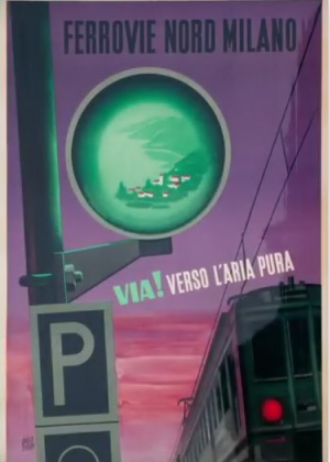
Brand identity
Since 1877, FNM has always been ahead of its time, putting people, the environment and innovation at the centre of its work. The new logo is a tangible visual sign of the Group’s identity, which is focused on innovation, communication and sharing.
HISTORICAL POSTERS


THE EVOLUTION OF THE LOGO

NEW LOGO
Origin of the new logo
With its square design, the new logo expresses all the strength and solidity that have derived from the Group’s over one hundred-year-long history. The Group’s openness to the dynamism, challenges and opportunities offered by social change are symbolised by the slanted green lozenge. This is accompanied by the phrase “life in motion”, which emphasizes its ability to propose innovative solutions that can adapt to the varied and increasingly demanding needs of contemporary society.
Una sorta di fregio, che rompe la staticità e produce un contrasto senza indebolire la forma che lo contiene, una forma rettilinea inclinata, dinamica.
Ciò che si genera è un segno distintivo, memorizzabile, cromaticamente riconducibile all’origine dell’identità di FNM, ma aperto ad un futuro verde, accessibile, sostenibile, condiviso e tutto da inventare.